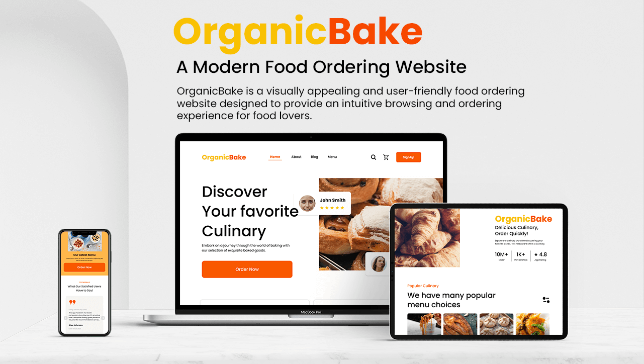
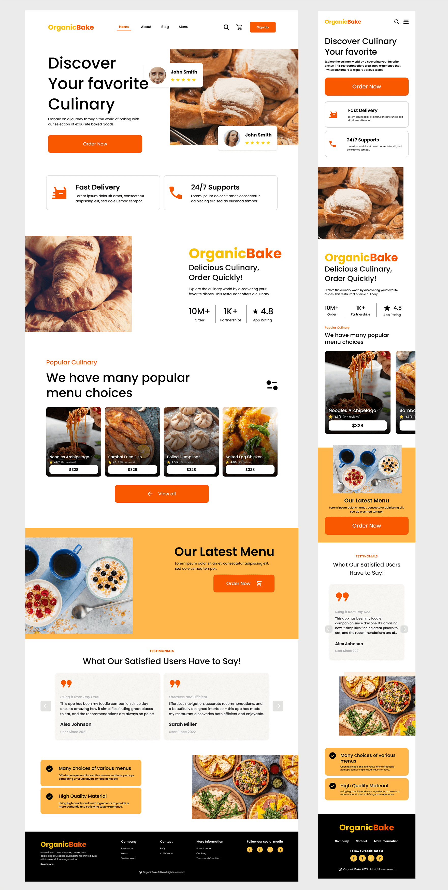
OrganicBake – A Modern Food Ordering Website
OrganicBake is a visually appealing and user-friendly food ordering website designed to provide an intuitive browsing and ordering experience for food lovers. My role as a UX/UI Designer was to craft a seamless digital journey, ensuring that both desktop and mobile versions offer a smooth and engaging experience.
Client
OrganicBake
Start
15 June 2024
Complete
15 Sep 2024
Services
UX/UI
Website
---
Description
OrganicBake is a visually appealing and user-friendly food ordering website designed to provide an intuitive browsing and ordering experience for food lovers. My role as a UX/UI Designer was to craft a seamless digital journey, ensuring that both desktop and mobile versions offer a smooth and engaging experience. The goal was to create a platform that balances aesthetic appeal with functionality, allowing users to explore, order, and enjoy their favorite meals effortlessly.
Key Features
-
Engaging Hero Section: A welcoming and visually appealing introduction to the brand with high-quality food imagery and a clear CTA.
-
Seamless Navigation: A structured menu that allows users to browse effortlessly between different sections.
-
Mobile-Optimized Experience: A responsive layout ensuring flawless usability on all screen sizes.
-
Popular Menu Highlights: Showcasing trending dishes with star ratings, prices, and customer reviews.
-
User Reviews & Testimonials: Social proof that enhances trust and engagement.
-
Promotional Offers & Call-to-Actions: Strategically placed to encourage users to place an order.
Technologies & Tools Used
-
UI Design Tools: Figma for wireframing and high-fidelity prototyping.
-
Responsive Framework:Bootstrap, Tailwind CSS
-
Frameworks Considered: React.js, Laravel
-
Visual Design: Clean and modern design with a focus on readability and engaging imagery
Design Highlights
-
Modern & Minimalistic UI: A clean, structured design that emphasizes usability.
-
High-Quality Visuals: Engaging imagery to enhance the user experience and showcase food offerings.
-
Intuitive User Flow: A frictionless ordering process that guides users from menu selection to checkout.
-
Consistent Branding: A well-defined color scheme and typography that aligns with the brand’s identity.
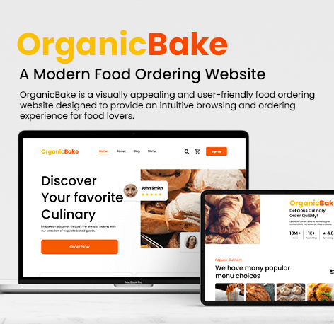
Screen Descriptions
-
Desktop Version – Landing Page: The desktop experience provides a bold and immersive introduction to the restaurant’s offerings. Users are greeted with high-resolution food images, a compelling call-to-action, and clear navigation that leads them to explore popular menu items, promotional offers, and customer reviews.
-
Mobile Version – Home Screen: Optimized for on-the-go users, the mobile version ensures easy access to menu items and quick ordering. The layout is streamlined to focus on essential features, allowing users to browse popular dishes, place orders, and navigate the site effortlessly with a thumb-friendly design.
Portfolio
.png)
nftbank.app - Decentralized NFT Trading Network
The project focused on designing and developing intuitive UI screens and front-end experiences for a decentralized freelance network, ensuring seamless navigation and usability for all stakeholders
- Project Info
-
Client
Anant US
-
Completion Time
6 months
-
Technologies
React Native, MongoDB, Figma, Github
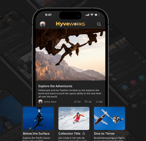
Hyve.app - Decentralized Freelance Network
The project focused on designing and developing intuitive UI screens and front-end experiences for a decentralized freelance network, ensuring seamless navigation and usability for all stakeholders
- Project Info
-
Client
Anant US
-
Completion Time
6 months
-
Technologies
React Native, MongoDB, Figma, Github
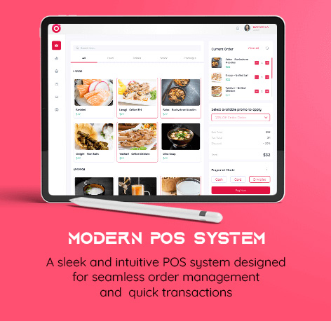
Sushi POS – Smart Point of Sale System
Sushi POS is a modern, intuitive, and efficient Point of Sale (POS) system designed specifically for restaurants.This system enables smooth order management, real-time analytics, customer tracking,
- Project Info
-
Client
Sushiko.ch
-
Completion Time
3 months
-
Technologies
Figma, Figma Dev, Adobe
OrganicBake – A Modern Food Ordering Website
OrganicBake is a visually appealing and user-friendly food ordering website designed to provide an intuitive browsing and ordering experience for food lovers.
- Project Info
-
Client
OrganicBake
-
Completion Time
3 months
-
Technologies
Figma, Figma Dev, Adobe